How to Read Stock Charts: A Beginner's Plain-English Guide
The four basics that make any stock chart make sense, what charts can tell you, what they can't, and how to use one without getting tricked.
Short answer: a stock chart shows the price of a stock over time. It can tell you what already happened. It cannot tell you what will happen next. Most of the patterns people swear by have no real predictive power. Here's how to read a stock chart without getting fooled.
Open any brokerage app and you see one within seconds — a wavy line, some red and green bars, maybe a moving average overlay or two. To a beginner, a stock chart looks complicated and important. To most professional value investors, it's a distraction. The truth is somewhere in the middle. Charts are useful, just not for the reasons most people think.
This guide is the plain-English version of how to read stock charts. The four pieces of information every chart shows. What the chart can genuinely tell you. What it can't, no matter what anyone on TV says. And the five-minute habit that turns a chart from a casino into a useful tool.
The four things every stock chart actually shows
Strip away the jargon and every chart you'll ever look at shows four things. That's it. Master these and you've already learned how to read stock charts better than most retail investors.
1. Price. The vertical axis (the up-down one) shows the price per share. A higher line means a higher price. Easy.
2. Time. The horizontal axis (the left-right one) shows the date. Left is older, right is more recent. Most charts have a "1D / 5D / 1M / 6M / 1Y / 5Y / Max" selector to change the time window.
3. Volume. The little bars at the bottom of most charts show how many shares were traded each day. Taller bar = more buying and selling that day. Volume matters because a price move on heavy volume usually means more than the same move on a quiet day.
4. Comparisons. Most charts let you overlay another line — usually the S&P 500 — to show whether the stock did better or worse than the market over the same period. This is the single most useful thing a chart can show, and most beginners ignore it.
That's the entire vocabulary. Everything else on a chart — moving averages, RSI, Bollinger bands, candle patterns — is either a different way of looking at these four things or noise pretending to be signal.
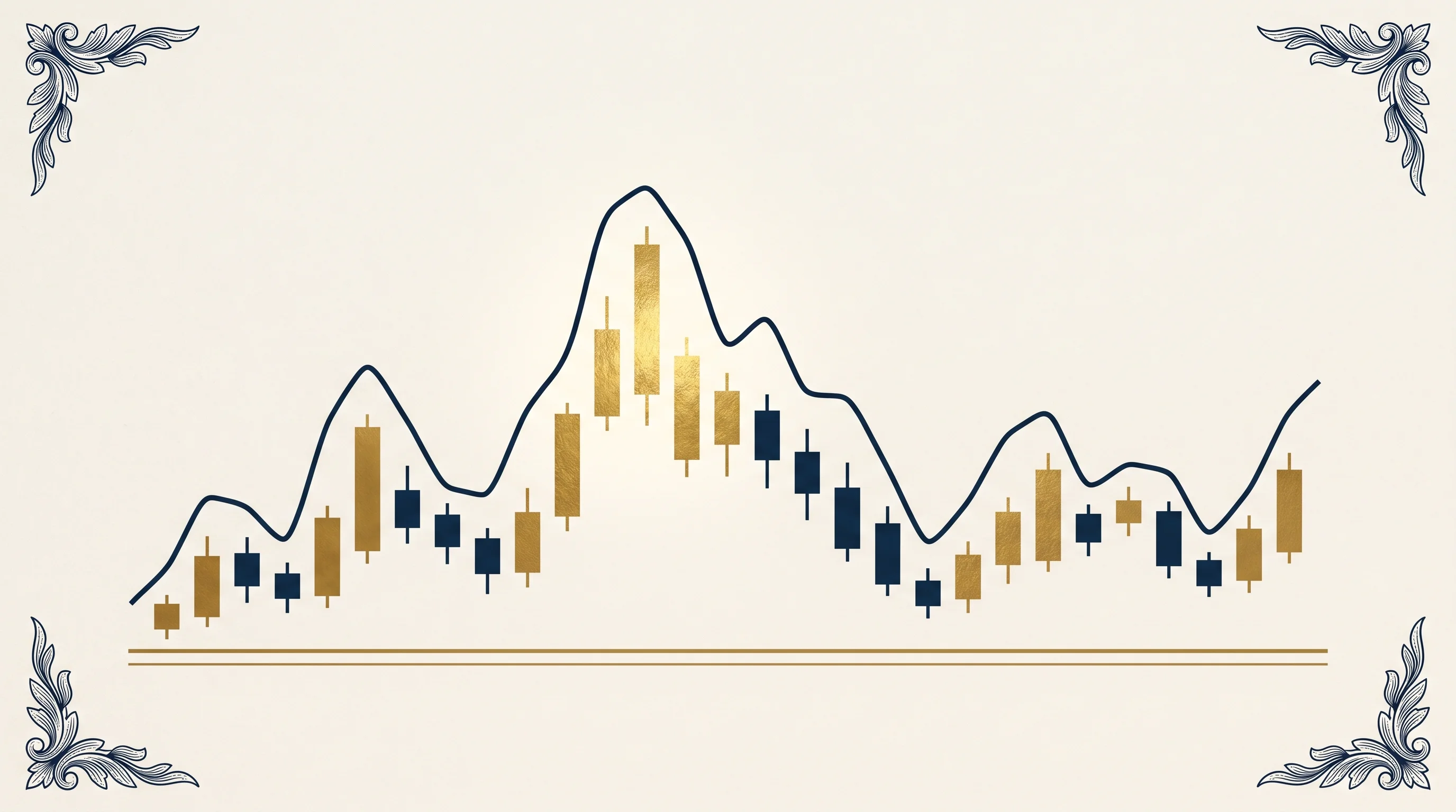
Line chart vs candlestick: which one for learning how to read stock charts?
When you first open a chart you usually get a choice between a line chart and a candlestick chart. Both show the same data. They just show it differently.
A line chart plots one price per day (usually the closing price) and connects them with a smooth line. Best for understanding the overall direction over time. Easy to read at a glance. This is what your savings-account app uses.
A candlestick chart plots four prices per day in a small vertical rectangle:
- The top and bottom of the rectangle show where the stock opened and closed.
- The thin lines sticking out top and bottom show the highest and lowest prices during the day.
- The colour tells you whether it closed higher (usually green) or lower (usually red) than where it opened.
Candles show more information per day than a line. They're useful if you care about how dramatic the daily moves were. For most beginners learning how to read stock charts, a line chart is enough. Switch to candles later if you find a reason to.
The three things a chart can genuinely tell you
This is where most articles on how to read stock charts go wrong. They teach you fifty patterns. The honest list of what a chart can actually tell you is short.
1. The recent trend. Is the stock going up, going down, or flat over the time window you're looking at? Useful as context — not as a prediction. The fact that a stock has gone up for six months tells you nothing about whether it will go up tomorrow.
2. The recent volatility. Did the price move in a tight range or in big zigzags? This tells you something about the stock's character — calmer businesses tend to have calmer charts. Useful for managing your own emotions: if you can't stomach a stock that swings 5 percent in a day, knowing that in advance helps.
3. How it did versus the market. Did the stock beat the S&P 500 over the period, lose to it, or roughly match it? This is the most underrated use of a chart. A stock that's "up 20 percent this year" sounds great until you notice the S&P was also up 20 percent and you took on more risk for the same return.
That's the honest list. Three things. Read them off the chart, then move on.
What a chart cannot tell you (even though people will swear it can)
Learning how to read stock charts properly is mostly about resisting the temptation to over-read them. Charts are silent about almost every question that matters.
- Whether the underlying business is good. A great chart can sit on top of a terrible business that's about to fall apart. A terrible chart can sit on top of a great business going through a temporary problem.
- What the company is actually worth. Price tells you what people are paying. It does not tell you what the business is worth. For that, you need the margin of safety formula and a basic cash-flow calculation.
- What will happen next. No chart pattern reliably predicts future prices. The studies that have tested this thoroughly find no edge in chart-pattern trading over decades. The people who tell you the chart says "buy" are guessing — they're just guessing with extra steps.
- Why something happened. A drop or a spike usually has a reason — earnings, news, a sector rotation, a regulator. The chart shows the move; it doesn't tell you the cause. Always check the news for the same period before drawing conclusions.
- Whether the recent past will continue. "The trend is your friend" sounds wise. It is not. Trends change exactly when most retail investors have come to believe in them.
The honest framing: charts are a record, not a prediction. Treating them as the latter is how retail investors lose money to people who do the actual work.
The five-minute habit that makes charts genuinely useful
Here's how a beginner who has just learned how to read stock charts can actually get value from one without falling into the trap of trying to predict the future.
Step 1 — Open the 1-year chart. Look at the line. Note the rough direction (up, down, sideways) and the rough range (calm, choppy, wild).
Step 2 — Toggle the S&P 500 overlay on. Is the stock above the market line over the year, below it, or alongside? This single comparison reframes everything — a "huge winner" is less impressive if the market also won by the same amount.
Step 3 — Look at volume on the biggest single-day moves. Tall volume bars on big drops tell you something serious happened. Quiet volume on a big drop usually means a few large sellers, not real fundamental news.
Step 4 — Open the 5-year chart. Has the stock had this kind of move before? A stock that's down 30 percent looks scary on a 6-month chart. The same drop looks like ordinary noise on the 5-year view.
Step 5 — Stop. That's the chart's contribution. Now go read the company's annual filing — the 10-K — for what's actually happening in the business. Our working investor's guide to the 10-K shows you exactly which sections matter.
Five minutes on the chart. Forty-five minutes on the filing. That's the right ratio.
What about technical analysis, moving averages, RSI, candlestick patterns?
The whole category of "technical analysis" — the moving averages, the Relative Strength Index, the Bollinger bands, the cup-and-handle patterns, the head-and-shoulders — is built on the idea that you can predict future prices from past prices. After fifty years of academic study, the honest answer is: mostly you can't, at the timescales that matter for long-term investing.
Three nuances are worth knowing:
- Trend-following with strict rules has some statistical edge over very long periods, but mostly for diversified portfolios — not for picking individual stocks. This is what trend-following hedge funds do, and it requires hundreds of positions and discipline most retail investors don't have.
- Some chart patterns work as self-fulfilling prophecies in the short run. If enough traders watch the "50-day moving average" and act on it, it can briefly move prices. This is noise, not investment edge.
- For day traders, charts matter more than fundamentals. Day trading is a different game with different rules and worse odds. If you're reading this guide, you're almost certainly not a day trader.
If you want to be a long-term investor — owning businesses for years, compounding returns — the chart is a five-minute check, and that's it. The fundamentals are where the work goes. Knowing how to read stock charts is a starting point, not the destination.
So, how should a beginner actually use a stock chart?
To wrap up the practical version of how to read stock charts the right way:
- Use the chart for context — what's the recent direction, what's the comparison to the market.
- Use it to manage your own emotions — knowing the historical volatility helps you not panic on normal moves.
- Use it to confirm something you already heard — if news says a stock dropped 8 percent, the chart shows it; if not, the news is stale.
- Do not use it to predict where the price is going next. Nobody can do that reliably from a chart.
- Do not use it as a substitute for reading the actual business — the chart is silent on what matters most.
Charts are useful exactly the way a thermometer is useful. It tells you the temperature right now. It does not tell you tomorrow's weather, what to wear, or whether your house is on fire. Use it for what it's for. That's the whole honest answer to how to read stock charts as a beginner.
Related reading
For the actual work that decides whether a stock is worth owning, see our how to find undervalued stocks and how to know if a stock is a good buy guides. To estimate what a business is actually worth (which the chart cannot do), see our how to value a stock for beginners plain-English walk-through. For the underlying methods, the margin of safety formula covers what to do once you have a fair-value estimate, and the DCF valuation guide shows the full version of the calculation.
For more long-form essays on plain-English stock analysis, see the rest of the Hub.